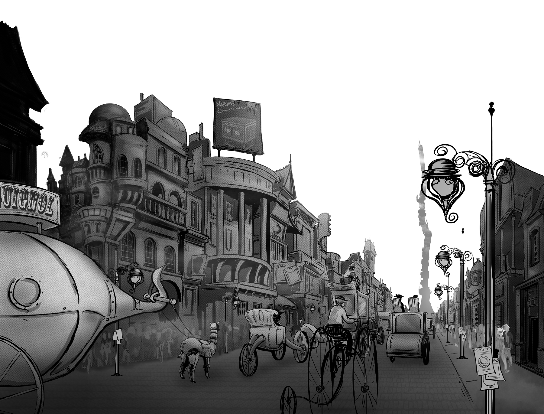
 This is a two page spread from chapter five. There will be a bit of text above the drawing on each page. I wanted an introductory drawing of the city for the reader. Now, I could easily spend weeks just adding more and more detail to every nook and cranny, however, time-wise I had to stay focused on what this spread needed to accomplish.Using a distant vanishing point, the drawing creates a sense of depth as if you are riding into the city. The same view as the main characters. So while there are no panels or dialog on the page, hopefully the picture tells at least three hundred words. Leaving out the sky was not so the text would be clear on a white background, but to give it a pop up book illusion, as if the buildings are standing up and out from the page. Maybe it works or maybe it was a cool idea with poor execution. Let me know what you think.

