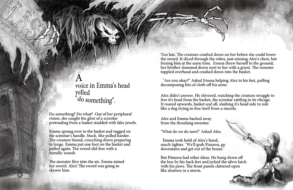
Since I'm going in a completely different direction for the novel, I'd thought I'd share an early layout mockup. This is more of a traditional style for combining graphics and text. It's fun, and I love getting to do spot drawings here and there, however, the new direction, I think, is infinitely more exciting. I'll have some completed samples of that soon.
Peek under the cover of the novel.
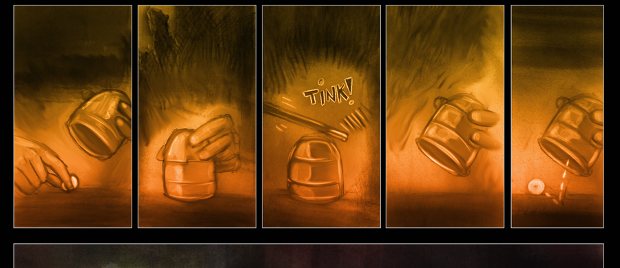
 This is the rough art for the opening to the novel. It opens with news coverage of a live escape by world famous magician, Angel Xavier. So yes, the book opens with sequential art. I'll post some more as the pages progress and add a look at how it will phase into the prose. I'm sure there'll be a few bugs to work out.Opening page of the novel.
A different sort of novel.
 Here' a picture from the opening of the novel. Yep, that's a panel. Which will be followed by several other panels and then a fade right into prose.So yes, I'm doing something different. An experiment of sorts. Kind of risky, but, what really helps is having confidence in this world, this story and most importantly, the characters. It's all there. Just comes down to execution.
HEROESONLINE :: HeroesCon 2013 :: Artists Alley Information
So while I continue to draw and paint pages, thought I'd post up my table for Heroes Con. My first time and I'm jazzed. Especially since this is my hometown con now.I'll be at table AA-214. Some Dog eat Doug stuff, but mostly focused on Monster Chefs. I'll have a spackling of Conjurers stuff to show too.HEROESONLINE :: HeroesCon 2013 :: Artists Alley Information.
Back in Production
 After months of the novel flitting around publishing purgatory, I've decided I can't let this little world of magicians languish any longer. The strip is back in production and by production I mean I've written up a weekly schedule for myself to keep it on track. So Savachia's story will continue and new stories (in webcomic format) will begin. I'm also back to work on the novel because I want to tell the story regardless of what or where it ends up. And it could very well end up here as an ebook. Which is fine and great by me as truthfully, rarely do so many of my passions come together in one make believe world and it's not one I'm willing to let slide into the abyss of "Oh I remember that idea".The next page, with all that said, will be up in the next few weeks. I'm working on three pages at a time which will also help keep me on track. And also on the long list of "hopes", I'd love to bring other artists on board to explore the other storylines that lead up to and around the novel. First things first. Gotta get this little seedling sprouting again before worrying about how many flowers it will foster.
Update on the Webcomic
I know the site has been stagnant for a bit. And it's about time I posted something as to why. The Conjurers webcomic has not gone away. In fact I'm still working on it...at an intensely slow pace. The first story is written but due to my new book, the strip and "The Conjurers" novel, I haven't been able to get a new page up. Also, we're moving and packing and taping boxes eats up a lot of time.The good news is that talks for the novel are moving forward. Also at an intensely slow pace, however that's due to what myself and my editor are trying to do. Which is something completely different. And when you try to do something completely different you don't know exactly what it is you're trying to do util you figure it out. And we're close to figuring it out. And during the time away from producing pages for the webcomic, I've re-thought the art a bit and will take the upcoming pages in a slightly different direction. I'm enjoying the techniques I'm using, and I'll keep using those. The changes will come in the form of a more realized style for the drawings. Which, if you flip back through the comic so far, you can tell the base layer of art (i.e. the pencils) wander a bit between comic book style and cartoony. I'm zeroing in on a set look.Thanks to all who have come along this far and the comic will return soon.
Character concept - the princess

This is a character that will be in the first webcomic story and in the novel. She is based on a real magician, Princess Tenyo. I'm a long way off on her look so I'll share some sketches from the process.
Some pages from the Moleskine
Thought I’d post some quick thumbnails from the sketchbook. Currently I’m scripting the entire story arc for the first episode of the webcomic. Once that’s done I’ll start the breakdowns for each page.
The above image is a definite scene from page two. I’m learning as I go that I’m just not going to get as much into each page as I thought. Taking a cue from Freakangels, I’m going for bigger panels with concentrated drama. Originally I thought the panel above would be on the first page. Not the case. Pacing will be key, as will character development. The trick is to hook the reader enough to come back without becoming a melodramatic cliffhanger.
The image below is a quick sketch of one of my favorite creatures from the story. It appears in the opening chapters of the Novel, and will also appear in the webcomic. It’s just a skull, spine and arms shrouded in decaying robes:
I’ll keep posting images from the sketchbook along with my initial outlines for the webcomic. Try to document my process, including all the horrendous errors and wrong turns the writing will initially take.
Notes on the webcomic

Here's the page where I finalized the layout for the first page. And I'll post the final art tomorrow (I hope).
Illustration Process: Flatting
Here we go with the boring part of this illustration: flatting. In essence I’m blocking in color, or in this case, grays. Each major section of the illustration gets colored in with a flat color (hence “flatting”) and they’re each on their own layer. There are several advantages to this approach.
First off, I can adjust the tones until I get the atmosphere I want. And get the focal points where I want them. Second, having each element on its own layer makes the detailing and texturing steps a lot easier.
It looks sloppy but here’s the flat stage:
Another illustration
Here we go with the second sample illustration from the novel. I’m doing a bit better recording the process on this drawing. This drawing shows the arrival of Christopher Aggler and the two spying faces of Alex and Emma. Here is the scanned inks:
As you can see, the drawing had to be scanned in two parts and pieced together in Photoshop. I line up the two scans as best I can then use the eraser to “blend” the seam. After that I mess with the levels to get nice, crisp line art:
Once I’ve rid myself of the blue pencil lines, I convert the image to grayscale, select the gray channel and fill it with black on a new layer. Now I have all the black lines on a transparent sheet which makes the coloring process easier.
In the next installment I’ll show the flatting process (insert yawn here).
First look: Book Illustration
Progress on the Illustration
Making some progress on one of the sample illustrations for the novel pitch. The first image is the start of the flatting process. Each element gets painted in with its own solid color. For this drawing I'm working in three sections: foreground, middle ground and the background. By keeping the elements separate, it'll make it a lot easier later on to establish depth and get the tonal range right.
In the illustration below, I've finished the flatting and have started working on the lighting and textures. And you can see where I started adding some fog in the middle ground. That's when having the elements on separate layers makes things easy.
Hopefully the next installment will have the finished piece.
Illustration Process
As you can see, this is not a continuation of the previous post on my illustration process.
This one is titled “The Gate” (you can see the inks for this in the main post at the top of the page). I’ve scanned the final drawing in and have started the painting process. I would love to color these by hand with just ink washes, but I don’t have the setup to scan in final product. So I’m recreating the same technique in Photoshop.
At this stage, I’m laying in my greys and only focusing on getting the tones right. Then I’ll build up the shadows and lights with light washes until I’m reasonably satisfied.
The edges are sloppy for now, as I’m creating a custom border for all the illustrations. Needless to say that’ll go on last.
Building an Illustration, Part II
Continuing off the sketches I posted last time, here are the pencils for the actual drawing:
And a little closer up:
As you can see I’m keeping the pencils almost as loose as a seagull. An that’s hard for me. For years, I worked for hours creating spandex tight pencils before whipping out the ink. My main focus is on the composition and the lighting. And those are two things I’ve always slacked on in the past.
And if I’m being perfectly honest, if the novel sells, I’ll probably re-do the sample illustrations. Just like in writing, re-drawing what you think is a ready to go layout usually brings about better results.
One last pic. Here’s the beginning of the inking process. I’ll have more details and pics on that in the next post:
Also, in the coming posts, I’ll write a bit more about the tools I’m using on this project.
Building an Illustration
I’m creating three or four sample illustrations to go along with the sample chapters from the novel. Thought I’d share the process from doodles to completed drawing.
This first one is popped out of chapter two: the arrival of eleven strangers to the mansion, focusing on man in particular. Choosing what to illustrate is the same as rewriting a chapter. You have to whittle it down to what’s important, or more importantly, what moves the story forward.
If you look in the top right corner of the page below you can see a thumbnail idea for the final drawing layout. The rest is just playing around with details until something sticks.
Here’s another page showing more of the main focus of the illustration. I’ve decided to go with more of a worms perspective, so the straight on guy in front of car is out. Although I think the sketch of the character is on track.
Also wanted to mention a charity cookbook project. I contributed a cartoon featuring Doug and Sophie. You can click on the link below to learn more and hopefully donate:
http://www.kickstarter.com/projects/tr1studios/webcomics-whats-cooking
Twitter for Cartoonists
New Podcast up at Tall Tale

This was a fun podcast. Of course doing any podcast with Tom Racine is a joy. The man is smooth. And I also got to chat with Francesco Marciuliano, an infinitely talented cartoonist and writer. Mike Witmer, the brilliant mind behind "Pinkerton" also swung by. We mostly chatted about the big man Berke Breathed ending Opus. So pop over and turn it on:
Super Fogeys in Print
 Honest to God, I was like a kid at Christmas today. The first three issues of Super Fogeys came in the mail! Now I've read them all online, but getting those books today reminded how cool it is to see your favorite strips in print.
Comic books still have the lead in the resolution game, not to mention the nostalgia of a lifelong addiction to the printed sequential medium. So now, if you're new to SF, these books are a great way to get started, and you don't have to worry about battery life while trying to get through all the strips. And if you've been a fan of SF and are all caught up on all the Space Pig goodness, you'll treasure these books even more.


 Dog eat Doug Book Store
