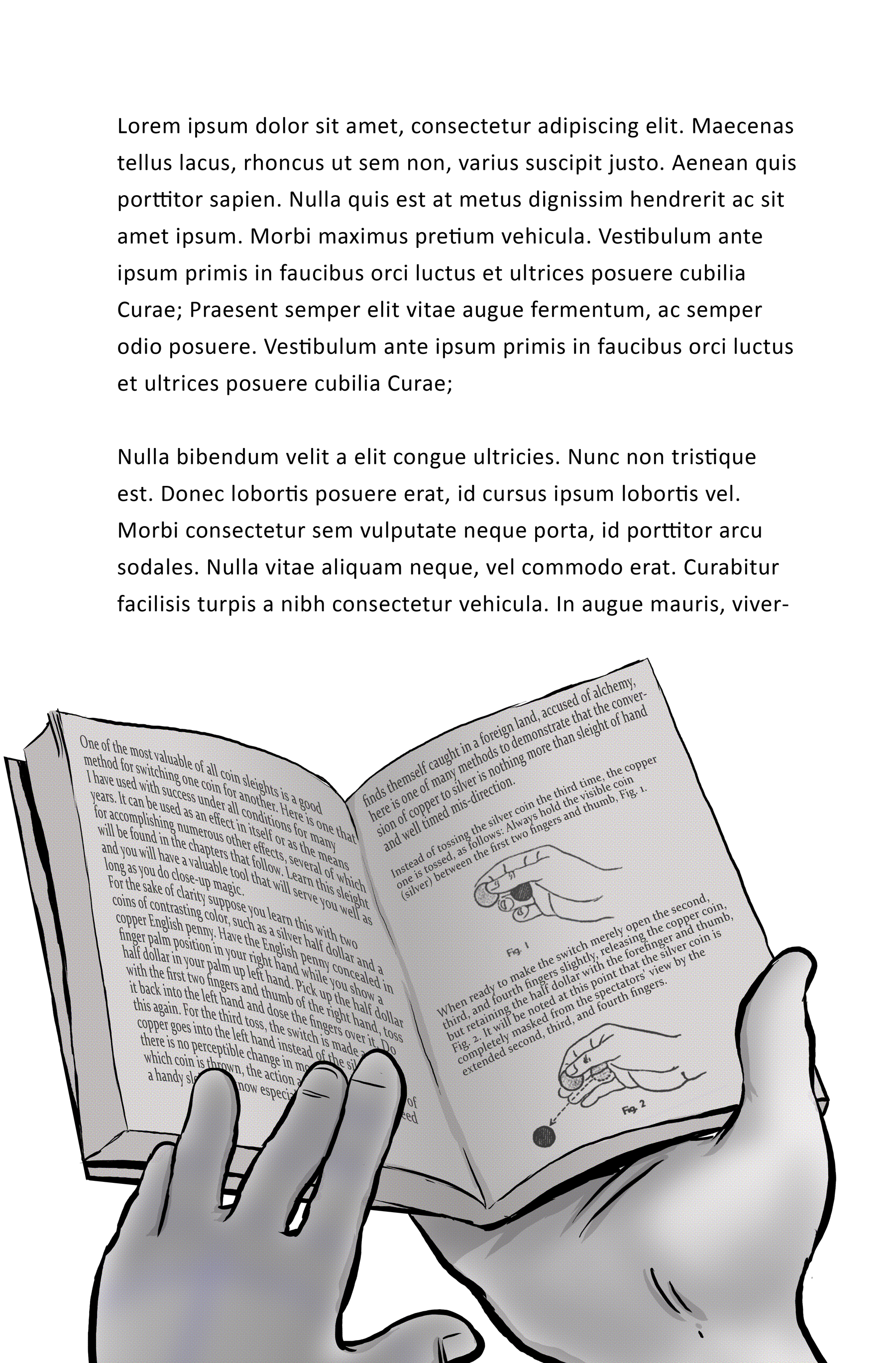
 Shooting a small flock with one stone here. I used this shot not only to highlight the mood of this scene, but to visually set up a few things for later. Avoiding spoilers, so I won't point them out. However, they are not necessarily plot points I am foreshadowing, but more like markers that will demonstrate how much has changed a little later on.
Setting the Scene
 Another drawing to set the scene. No sequentials or dialog on this one. A bit more traditional in the sense that it's just a visual for the scene. It's more to set the tone of Emma's darkening journey. On the left side I used a cutaway technique to make the page appear torn in the shape of the entrance into the theater.
Movie sets on paper.
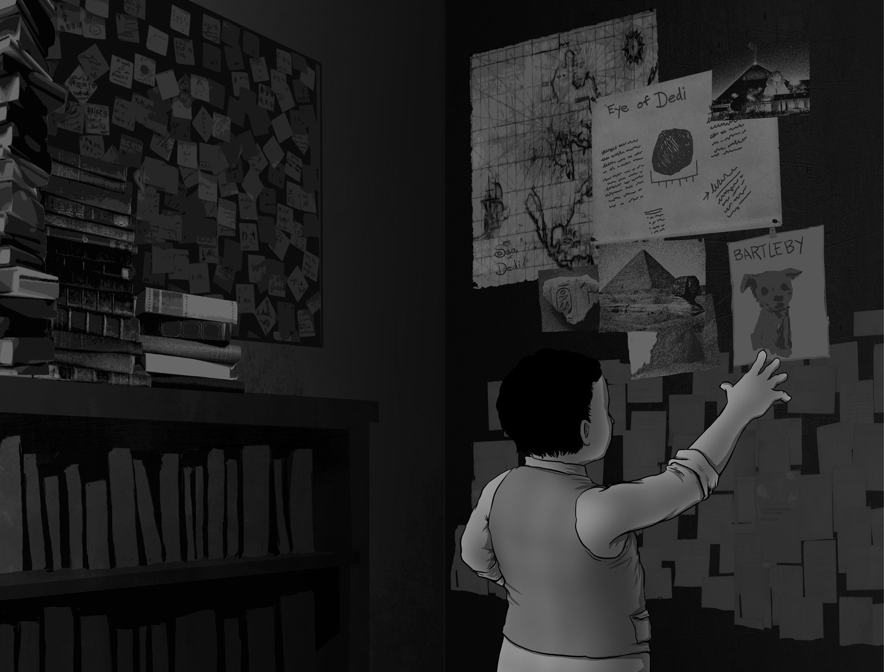 Here's a two page spread from chapter seven. Might have to makes some changes if some of the prose ends up on the left side. Again, spoiler filter on, so I won't divulge exactly what this scene is. This two page spread accomplishes several things. First off I can visually set the mood that flows from the text. Second, I can show all the important bits instead of spending several paragraphs describing what you see here. And my favorite bit, I can drop in Easter eggs that relate to book two.
Illustrating a book within a book.
Cliffhangers
 Here's the opening to chapter seven. When last we left Alex, he was locked up in the tower. So when it came time to switch back to him, I decided to go right into sequentials to give it that movie feel. Unlike comics, I decided, for the most part, to keep the panels a uniform size, much like a movie screen. When each panel is the same your mind tends to run the images together, just like a film. I think, at this point, I would only change the panel structure if it was integral to the storytelling.
Cinematic Storytelling
 One type of illustration that seems to occur more often than others is the end of chapter spot illustration. For whatever reason I like to include some drawing or sequential at the end of chapters. In one sense, it's a natural way to plow from prose into a drawing and "end scene". Ideally I want the drawing at the end of a chapter to make the reader want to turn the page or, as in the next example, leave them with an "uh-oh" foreshadowing moment.
 This piece comes at the end of another chapter where two of the characters are heading into ramshackled theater. A cliffhanger that sticks in the readers mind until we get back to these two people. In this particular scene, I didn't want to darken the whole page as I did with the interior shot of the tree. Like I said, that's a technique I don't want to overuse, because it'll lose its impact and too much of white text on black is annoying.Instead, I surrounded the two characters with almost completely black buildings to achieve the same sense of dread.
Illustrating a Novel
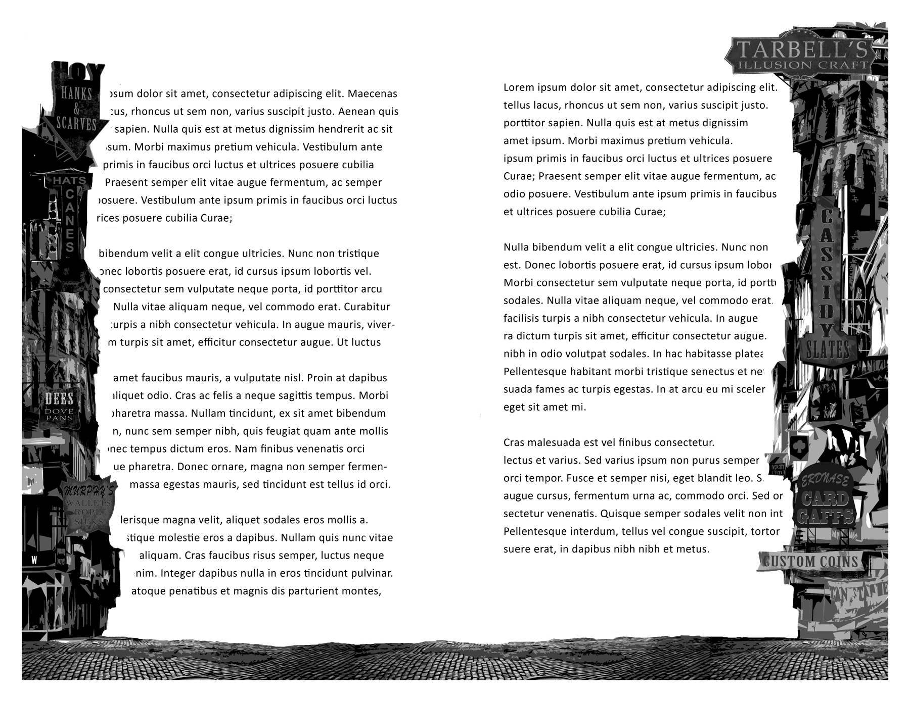 This book started with an empty toolbox for blending illustration and prose. As I go along certain techniques pop up, but I don't want to over use them. It also has to make sense within the context of the story. Here for example, two of the characters are walking into the rough section of the city. Dilapidated factories, boarded up shops, anything that represents the collapse of the magical industry. Instead of bloating the prose with description, i decided to "wall in" the text with the buildings surrounding the characters. This, again hopefully, not only conveys some of the description visually but also mirrors the characters experience. And it was also a chance to slip in a bunch of magician references.
Combining prose and comics.
 Continuing on from the last piece I posted, which was a sequential scene of the characters approaching the tower. Here we are on the next page, and I've overlayed the prose onto the scene inside the tower. The illustration naturally lent itself for this, and again, the large black space not only allowed room for text but helped carry over the looming, shadowy feel from the preceding tower drawing.I'm trying not to overuse this technique, because other than this instance, it feels like cheating or kind of lazy. it just happened to work with the feelings I wanted to project in this scene.
For the Webcomic Readers
 Had to share this one for all of you reading the speed drawing experiment that is the Conjurers webcomic. You can probably guess who the boy is falling out of the sky. Completely different style than in the comic, but I think his general essence comes through. Keep reading the webcomic to see how he gets here.
Welcome to Conjurian City
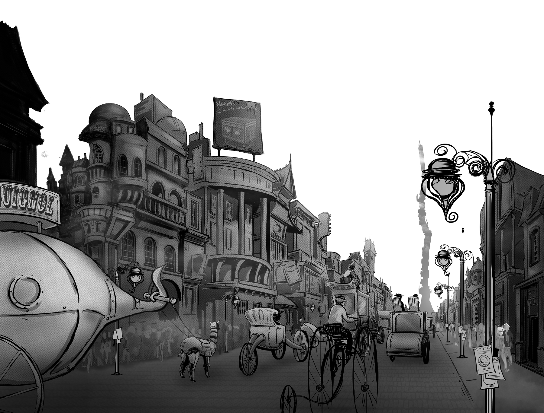 This is a two page spread from chapter five. There will be a bit of text above the drawing on each page. I wanted an introductory drawing of the city for the reader. Now, I could easily spend weeks just adding more and more detail to every nook and cranny, however, time-wise I had to stay focused on what this spread needed to accomplish.Using a distant vanishing point, the drawing creates a sense of depth as if you are riding into the city. The same view as the main characters. So while there are no panels or dialog on the page, hopefully the picture tells at least three hundred words. Leaving out the sky was not so the text would be clear on a white background, but to give it a pop up book illusion, as if the buildings are standing up and out from the page. Maybe it works or maybe it was a cool idea with poor execution. Let me know what you think.
Illustration Process
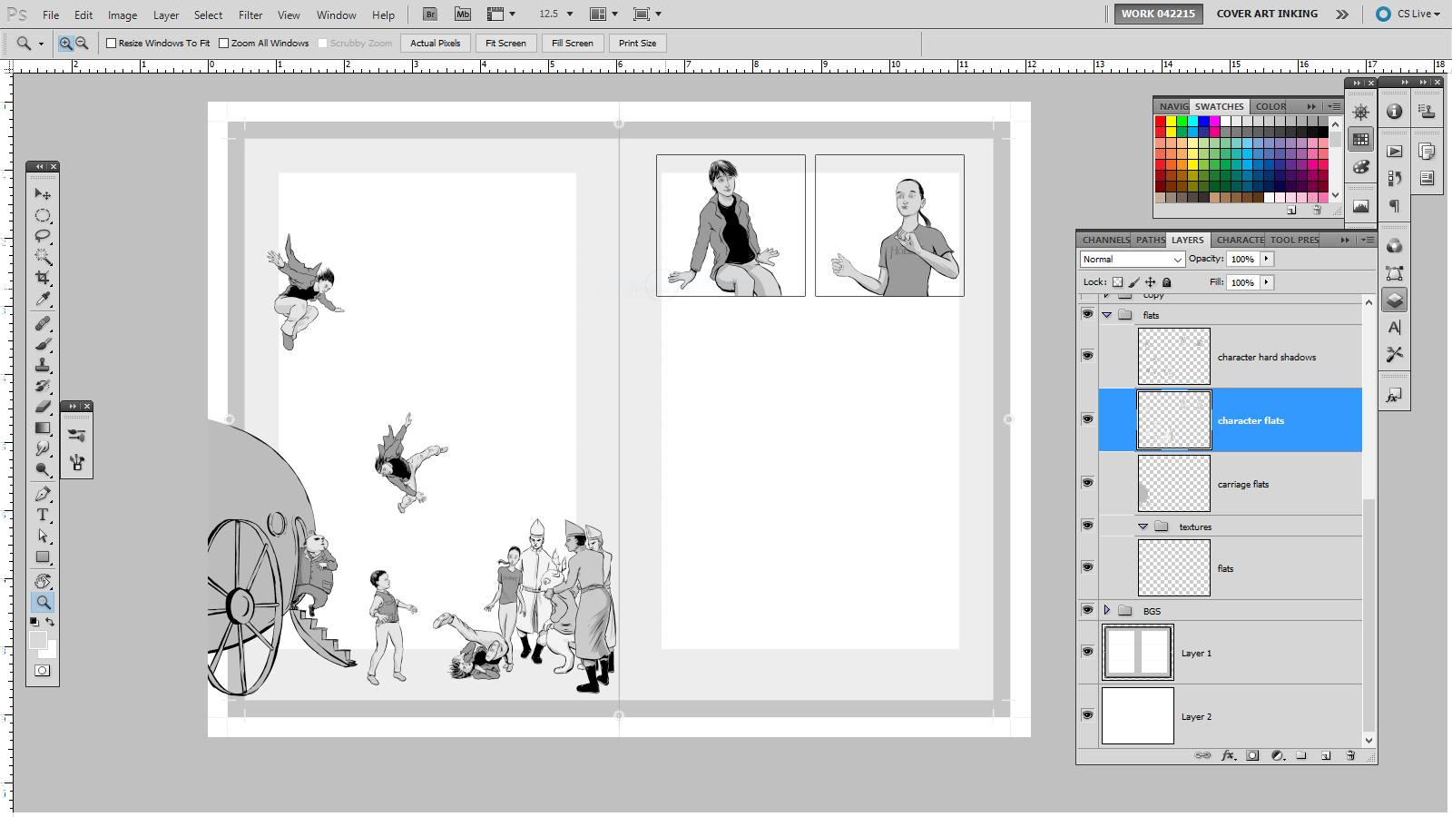 Quick screen crap of my process. This is a two page spread at the end of chapter five. Inking and flatting are done. Now I'm adding hard line shadows. After that, I build up the more subtle shading then add some texturing. The text will flow around these illustrations and below the two panels on the right page.I'm getting more comfortable with this process, mostly from doing it a lot. I'm usually a mess, never doing the same technique twice, but a project like this needs consistency.
Animating a Two Page Spread
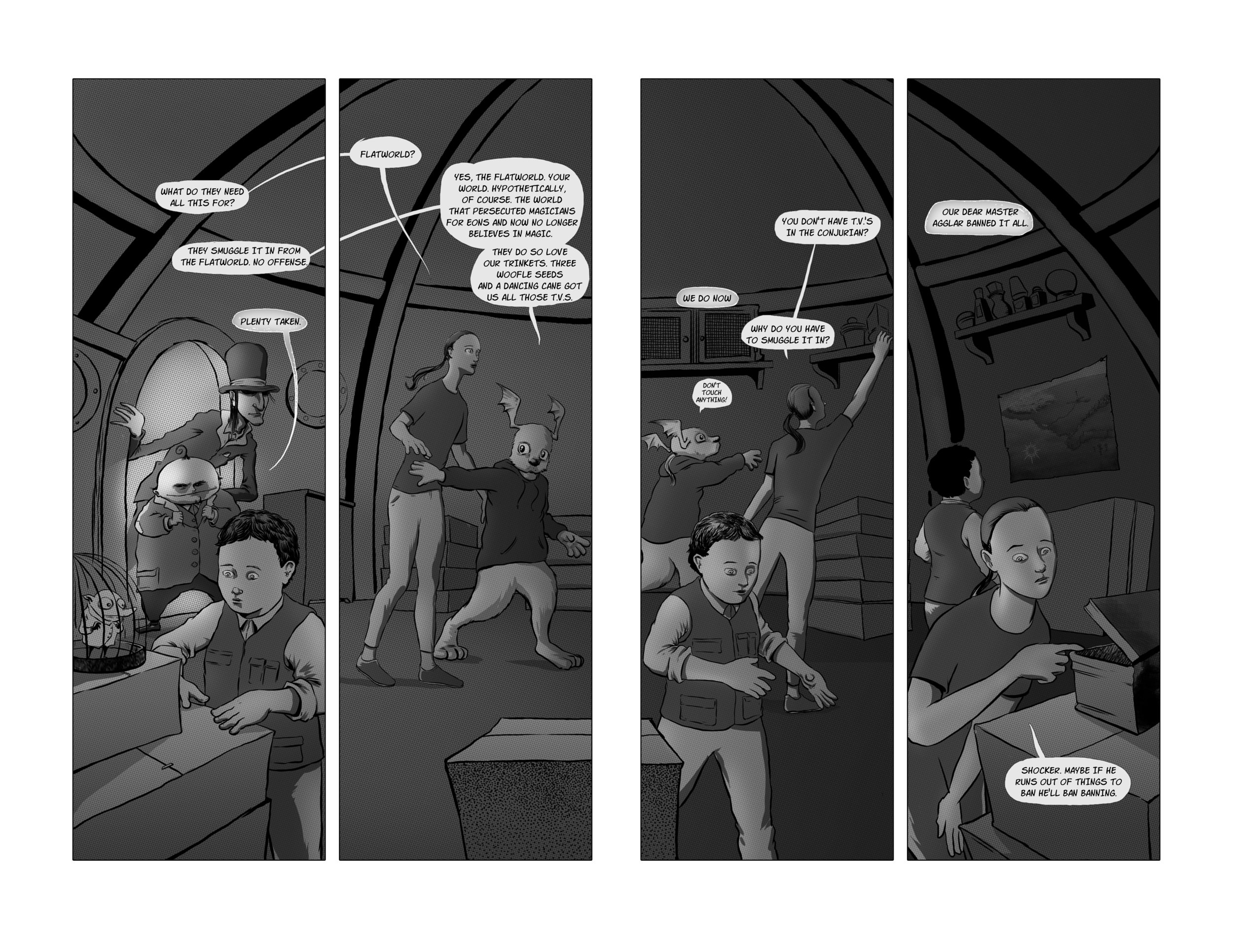 Moving along with the art from chapter four. This posted piece is a two page spread. The previous page is all prose ending with the kids entering the carriage. You flip the page and voila, you get to see what they see. I needed to accomplish a lot in this spread. First off, I'm setting up the interior of the carriage (it comes up again later) but more importantly, I get to show a little of what the Grubians do as opposed to just chatting about it in the prose.Meanwhile, the dialog helps set up some more important elements, all set against a static background where the characters move from panel to panel, hopefully giving it a cinematic effect as opposed to hopping from panel to panel.
Puppets and Prose
A while back I posted some concept sketches of puppets. Thought I'd share how they ended up and why I used puppets. In chapter four of the novel we happen upon some characters, who, while they are major characters, also happen to be travelling puppeteers. That profession may or may not be a cover for more nefarious endeavors. No spoilers.So this presented an opportunity to drop in critical backstory and, being that parts of the novel are illustrated, what better way to sneak in said bit of backstory by illustrating the puppet show. The prose transitions into the sequentials I've posted below. It is a very rudimentary creation myth as told by puppets.

Designing puppets.
A Dog and His Padawans.
The foster pups have moved on to their new homes, somewhere in Maine. Luther did a fine job getting them ready. Sophie is still not speaking to me.
Joe Frankenstein
Dock Dogs
A Few Reviews for "Dog eat Doug" Volume 2
It Came from the Diaper Pail, Dog eat Doug Volume 2 - Kindle edition by Brian Anderson. Literature & Fiction Kindle eBooks @ Amazon.com. My first ebook journey is off to a good start. Thanks to everyone who has checked it out so far. And thanks for the reviews! This one is from Rene R.:
Really loved reading It Came from the Diaper Pail. Look forward to re-reading it. Sophie is adorable and Doug is so cute. Thanks Brian for writing Dog eat Doug.
Although I quite liked this succinct write up from John Cuellar:
This is a pretty good comic strip.
If you download a copy, I truly appreciate the reviews. Click here to buy "It Came from the Diaper Pail, Dog eat Doug Volume 2" - Kindle edition
A new Conjurers Webcomic Page
Still trying to get two pages up a week. It would serve the story better to keep things moving instead of falling into the rhythm of a weekly cliffhanger. Mostly it comes down to spending spare moments scratching at the plot and scripting out a few pages at a time. The art side of things is getting faster. Hopefully not too fast that it comes off as sloppy. The Conjurers Comic Strip on GoComics.com
I never say "must watch" but...
 Davinci and Craig Ferguson referenced in the same vid. How could you go wrong?Delve Video Essays | The Long Game Part 1
